set.seed(0)
x <- sample(0:9, 100, rep=T) QQ-plots in R vs. SPSS
We teach two software packages, R and SPSS, in Quantitative Methods 101 for psychology freshman at Bremen University (Germany). Sometimes confusion arises, when the software packages produce different results. This may be due to specifics in the implemention of a method or, as in most cases, to different default settings. One of these situations occurs when the QQ-plot is introduced. Below we see two QQ-plots, produced by SPSS and R, respectively. The data used in the plots were generated by:
SPSS

R
qqnorm(x, datax=T)      # uses Blom's method by default
qqline(x, datax=T)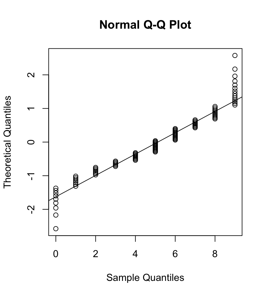
There are some obvious differences:
- The most obvious one is that the R plot seems to contain more data points than the SPSS plot. Actually, this is not the case. Some data points are plotted on top of each in SPSS while they are spread out vertically in the R plot. The reason for this difference is that SPSS uses a different approach assigning probabilities to the values. We will expore the two approaches below.
- The scaling of the y-axis differs. R uses quantiles from the standard normal distribution. SPSS by default rescales these values using the mean and standard deviation from the original data. This allows to directly compare the original and theoretical values. This is a simple linear transformation and will not be explained any further here.
- The QQ-lines are not identical. R uses the 1st and 3rd quartile from both distributions to draw the line. This is different in SPSS where of a line is drawn for identical values on both axes. We will expore the differences below.
QQ-plots from scratch
To get a better understanding of the difference we will build the R and SPSS-flavored QQ-plot from scratch.
R type
In order to calculate theoretical quantiles corresponding to the observed values, we first need to find a way to assign a probability to each value of the original data. A lot of different approaches exist for this purpose (for an overview see e.g. Castillo-Gutiérrez, Lozano-Aguilera, & Estudillo-Martínez, 2012b). They usually build on the ranks of the observed data points to calculate corresponding p-values, i.e. the plotting positions for each point. The qqnorm function uses two formulae for this purpose, depending on the number of observations \(n\) (Blom’s mfethod, see ?qqnorm; Blom, 1958). With \(r\) being the rank, for \(n > 10\) it will use the formula \(p = (r - 1/2) / n\), for \(n \leq 10\) the formula \(p = (r - 3/8) / (n + 1/4)\) to determine the probability value \(p\) for each observation (see the help files for the functions qqnorm and ppoint). For simplicity reasons, we will only implement the \(n > 10\) case here.
n <- length(x)          # number of observations
r <- order(order(x))    # order of values, i.e. ranks without averaged ties
p <- (r - 1/2) / n      # assign to ranks using Blom's method
y <- qnorm(p)           # theoretical standard normal quantiles for p values
plot(x, y)              # plot empirical against theoretical values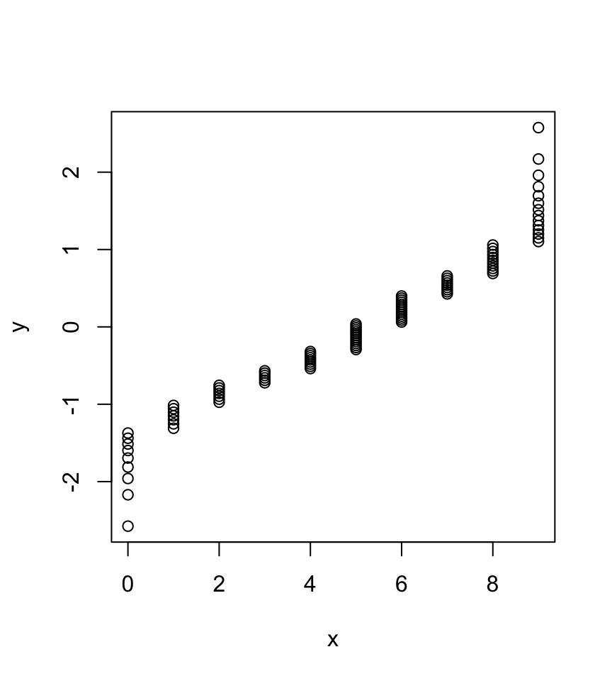
Before we take at look at the code, note that our plot is identical to the plot generated by qqnorm above, except that the QQ-line is missing. The main point that makes the difference between R and SPSS is found in the command order(order(x)). The command calculates ranks for the observations using ordinal ranking. This means that all observations get different ranks and no average ranks are calculated for ties, i.e. for observations with equal values. Another approach would be to apply fractional ranking and calculate average values for ties. This is what the function rank does. The following codes shows the difference between the two approaches to assign ranks.
v <- c(1,1,2,3,3)
order(order(v))     # ordinal ranking used by R
[1] 1 2 3 4 5rank(v) # fractional ranking used by SPSS[1] 1.5 1.5 3.0 4.5 4.5R uses ordinal ranking and SPSS uses fractional ranking by default to assign ranks to values. Thus, the positions do not overlap in R as each ordered observation is assigned a different rank and therefore a different p-value. We will pick up the second approach again later, when we reproduce the SPSS-flavored plot in R.1
The second difference between the plots concerned the scaling of the y-axis and was already clarified above.
The last point to understand is how the QQ-line is drawn in R. Looking at the probs argument of qqline reveals that it uses the 1st and 3rd quartile of the original data and theoretical distribution to determine the reference points for the line. We will draw the line between the quartiles in red and overlay it with the line produced by qqline to see if our code is correct.
plot(x, y)                      # plot empirical against theoretical values
ps <- c(.25, .75)               # reference probabilities
a <- quantile(x, ps)            # empirical quantiles
b <- qnorm(ps)                  # theoretical quantiles
lines(a, b, lwd=4, col="red")   # our QQ line in red
qqline(x, datax=T)              # R QQ line
The reason for different lines in R and SPSS is that several approaches to fitting a straight line exist (for an overview see e.g. Castillo-Gutiérrez, Lozano-Aguilera, & Estudillo-Martínez, 2012a). Each approach has different advantages. The method used by R is more robust when we expect values to diverge from normality in the tails, and we are primarily interested in the normality of the middle range of our data. In other words, the method of fitting an adequate QQ-line depends on the purpose of the plot. An explanation of the rationale of the R approach can e.g. be found here.
SPSS type
The default SPSS approach also uses Blom’s method to assign probabilities to ranks (you may choose other methods is SPSS) and differs from the one above in the following aspects:
- As already mentioned, SPSS uses ranks with averaged ties (fractional rankings) not the plain order ranks (ordinal ranking) as in R to derive the corresponding probabilities for each data point. The rest of the code is identical to the one above, though I am not sure if SPSS distinguishes between the \(n <= 10\) and \(n > 10\) case.
- The theoretical quantiles are scaled to match the estimated mean and standard deviation of the original data.
- The QQ-line goes through all quantiles with identical values on the x and y axis.
n <- length(x)                # number of observations
r <- rank(x)                  # a) ranks using fractional ranking (averaging ties)
p <- (r - 1/2) / n            # assign to ranks using Blom's method
y <- qnorm(p)                 # theoretical standard normal quantiles for p values
y <- y * sd(x) + mean(x)      # b) transform SND quantiles to mean and sd from original data
plot(x, y)                    # plot empirical against theoretical values
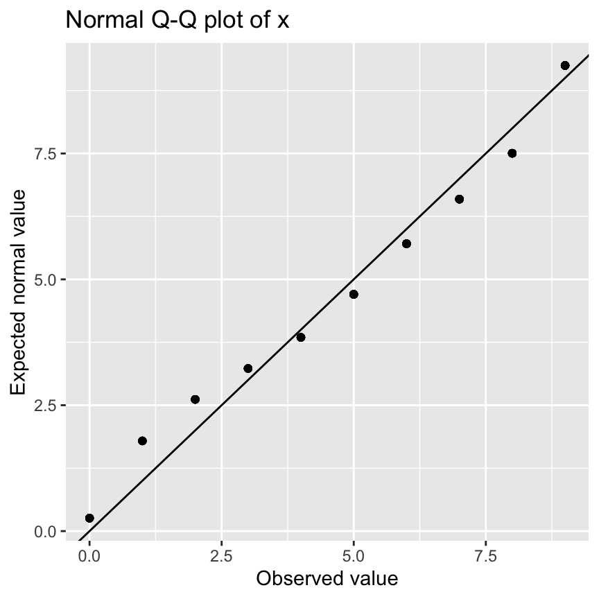
Lastly, let us add the line. As the scaling of both axes is the same, the line goes through the origin with a slope of \(1\).
abline(0,1) # c) slope 0 through origin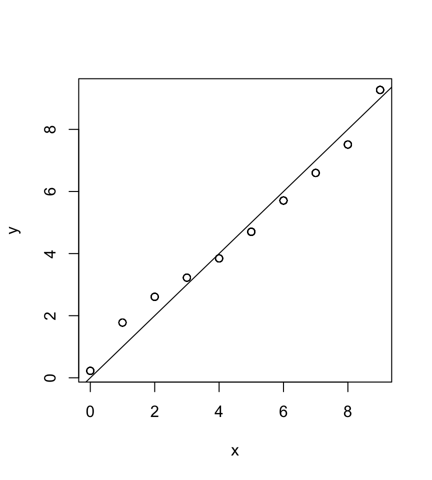
The comparison to the SPSS output shows that they are (visually) identical.
Function for SPSS-type QQ-plot
The whole point of this demonstration was to pinpoint and explain the differences between a QQ-plot generated in R and SPSS, so it will no longer be a reason for confusion. Note, however, that SPSS offers a whole range of options to generate the plot. For example, you can select the method to assign probabilities to ranks and decide how to treat ties. The plots above used the default setting (Blom’s method and averaging across ties). Personally I like the SPSS version. That is why I implemented the function qqnorm_spss in the ryouready package, that accompanies the course. The formulae for the different methods to assign probabilities to ranks can be found in Castillo-Gutiérrez et al. (2012b). The implentation is a preliminary version that has not yet been thoroughly tested. You can find the code here. Please report any bugs or suggestions for improvements (which are very welcome) in the github issues section.
library(devtools)
install_github("markheckmann/ryouready")                # install from github repo
library(ryouready)                                      # load package
library(ggplot2)
qq <- qqnorm_spss(x, method=1, ties.method="average")   # Blom's method with averaged ties
plot(qq)                                                # generate QQ-plot
ggplot(qq)                                              # use ggplot2 to generate QQ-plot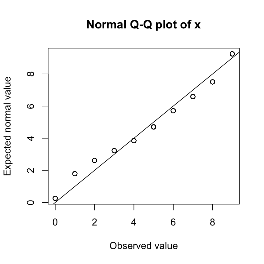
Literature
- Blom, G. (1958). Statistical Estimates and Transformed Beta Variables. Wiley.
- Castillo-Gutiérrez, S., Lozano-Aguilera, E. D., & Estudillo-Martínez, M. D. (2012a). A New Proposal to Adjust a Straight Line to a Normal Q-Q Plot. Journal of Mathematics and System Science, 2(5), 327–333.
- Castillo-Gutiérrez, S., Lozano-Aguilera, E., & Estudillo-Martínez, M. D. (2012b). Selection of a Plotting Position for a Normal Q-Q Plot. R Script. Journal of Communication and Computer, 9(3), 243–250.
Footnotes
Technical sidenote: Internally,
qqnormuses the functionppointsto generate the p-values. Type instats:::qqnorm.defaultto the console to have a look at the code.↩︎